80 jamovi and ESCI charts
🏠 Self-study
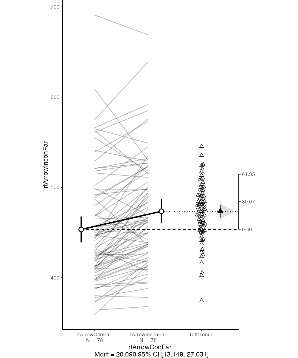
You covered creating charts with Excel in one of your workshops. An alternative is to use jamovi and ESCI. The figure below is what ESCI produces out of the box when comparing far congruent and incongruent flanker RTs. While the figure could be improved further (see “Graph Options” in jamovi), it already has a number of key advantages over what can be created with Excel (or SPSS):
- It shows raw RTs as well as RT differences (i.e., the actual interference effects).
- It shows between-subjects as well as within-subjects CIs.1
- It shows means as well as individual data points.
Instructions on how to add ESCI to jamovi can be found here.
Note that the distinction between between-subjects and within-subjects variability is crucial for your understanding. The confidence intervals displayed for “rtArrowConFar” and “rtArrowInconFar” reflect between-subject variability—that is, they depend on how variable the mean RTs are between participants. However, for our statistical test, this does not matter at all. A paired-samples/one-sample t-test is not concerned with this variability.
What matters for the paired-samples/one-sample t-test is the confidence interval displayed for “Difference”—specifically, how consistent the differences between incongruent and congruent mean RTs are.
If the distinction between these two types of variability does not make intuitive sense to you, talk it over with a friend or an AI. It’s really important to understand for a number of statistical procedures.↩︎