Chapter 15 A closer look at attrition
As usual, I feel that Beth’s explanations in Chapters 10 and 11 are very clear. However, there is one section where I feel things are more complicated than described in the book. This is the section “Attrition Threats to Internal Validity”, where Beth describes how participant dropout can become a threat to internal validity if the participants dropping out scored at the high end of the distribution (see Fig. 11.6 A in Beth’s book).
However, in my view an attrition threat can exist even if the participants dropping out had scores in the middle of the distribution (similar to Beth’s Fig. 11.6 B). The key to understanding this threat is to realise that the study described uses a within-subjects design with two measurement time points. These designs are analysed by investigating how consistent effects in the group are. Basically, for each participant one subtracts the score at time point 1 from the score at time point 2 and then asks “Is the mean difference significantly different from 0?”.
Consider the following example: Let’s assume Fig. 15.1 displays the results of a psychotherapy study and the values on the y-axis are from a questionnaire measuring wellbeing before and after the intervention (high values indicate high wellbeing, low values low wellbeing). Data from eight participants are displayed. Each participant had a wellbeing score at time point 1 and a wellbeing score at time point 2. For each participant, these two values are connected by a line. Note that 6 participants get better as a result of the intervention, but two get worse. If we were to test the effect of the intervention statistically, we would find that the intervention has no significant effect (p = .89).
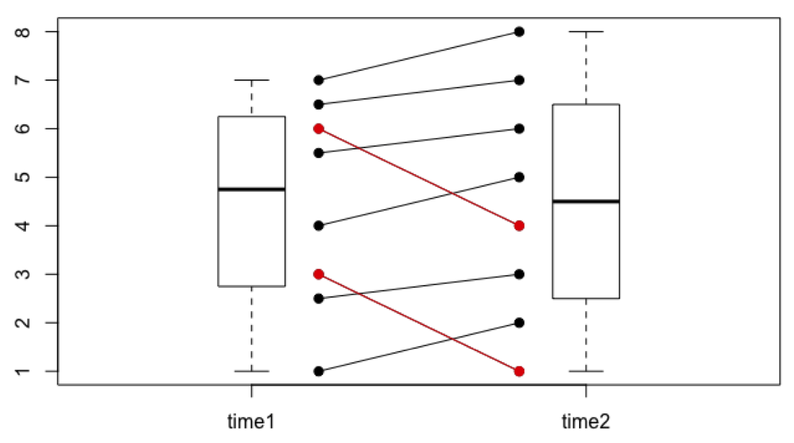
Figure 15.1: Intervention study example without attrition. Individual data points are represented as circles connected by lines. The participants shown in red are those who drop out in the example below. The boxes next to the circles are called boxplots. They are an alternative way to represent the distribution of the data points.
Now let us assume that the those two participants who got worse dropped out of the study (Fig. 15.2). This is not so implausible. After all, they must have realised that they weren’t feeling better as a result of the intervention—on the contrary, their wellbeing decreased over time. Due to the missing scores for time point 2 for these two participants, we cannot include them in our statistical analysis (because we cannot calculate the difference score). So, we include the remaining six participants. What do we find? A statistically significant effect (p < .001)!
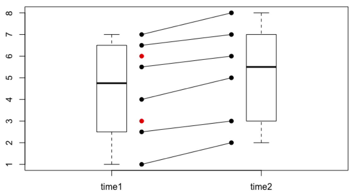
Figure 15.2: Intervention study example with attrition.
Note that contrary to the two dropouts shown in Fig. 11.6 A in Beth’s book, our two participants are not extreme in any way at time point 1. Nevertheless, their attrition has a substantial effect on the results! It is very difficult to prevent this type of attrition threat. The researcher could try to contact the participants who dropped out and try to find out if they dropped out due to reasons related or unrelated to the study. The researcher could also introduce more measurement time points to be able to more closely monitor the development over time.