Chapter 72 Creating charts
In this chapter, I’m going to show you how to create bar charts/point plots using Excel and SPSS. The videos are a bit longer than strictly necessary, because I decided to create these graphs without any advance preparation (I usually use Python to create graphs, so don’t really have much experience using Excel or SPSS for this purpose). Apart from potentially being more fun to watch, I thought it might also be helpful for you to see what I do when I hit a wall (and I hit a few…).
72.1 Excel bar chart
Here is a video of me creating a bar chart in Excel (29 min):
Jonathan pointed out that the “Near trials” label can be added below the x-axis by going to Add Chart Element → Axis Titles → Primary Horizontal. For some reason I thought axis title would refer to the labels under the bars.
72.3 jamovi and ESCI
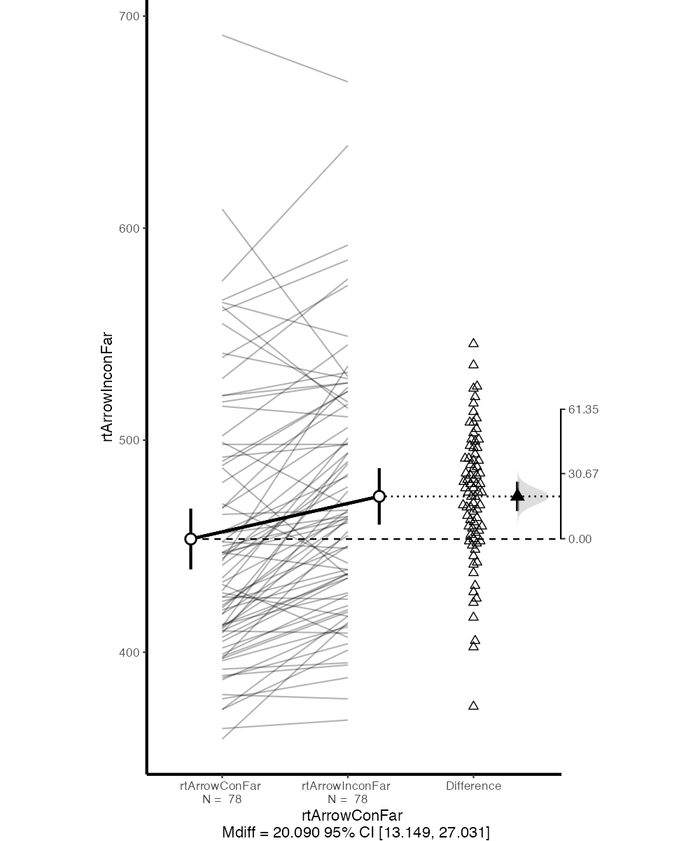
Another alternative would be to use jamovi and ESCI. Instructions on how to add ESCI to jamovi can be found here. For example, the figure below is what ESCI produces out of the box when comparing far congruent and incongruent flanker RTs. While the figure could be further refined (see “Graph Options” in jamovi), it has a number of advantages over what can be created with Excel and SPSS:
- It shows raw RTs as well as RT differences.
- It shows between-subjects as well as within-subjects CIs.
- It shows means as well as individual data points.
