Chapter 31 Descriptives for continuous data
For continuous variables, there are a number of options for screening, all found under Analyze → Descriptive Statistics:
- Frequencies
- Descriptives
- Explore
Unfortunately, there is quite some overlap between these options, which can make it hard to remember the differences between them. I spent some time going through these and have summarised commonalities and differences for you. Frequencies, Descriptives and Explore all offer the following:
- Mean
- Standard deviation, variance
- Minimum/maximum, range
- Standard error of the mean
- Kurtosis
- Skewness
Frequencies and Explore offer in addition:
- Median
- Histograms
- Percentiles (more options under Frequencies)
Unique to Frequencies:
- Histogram with normal curve overlaid
Unique to Explore:
- 95% confidence interval for the mean
- 5% trimmed mean (mean after removing the top 5% and bottom 5% of the values)
- Interquartile range
- Identification of “outliers” (simply the 5 highest and lowest values for each variable)
- Stem-and-leaf plots
- Normality plots (Q-Q plots), including significance tests
- Boxplots
I would encourage you to have a look at Explore at some point to see what you can learn from the detailed information that Explore provides. However, for our present purposes Frequencies are sufficient. We are going to compute frequencies for all of our scale variables:
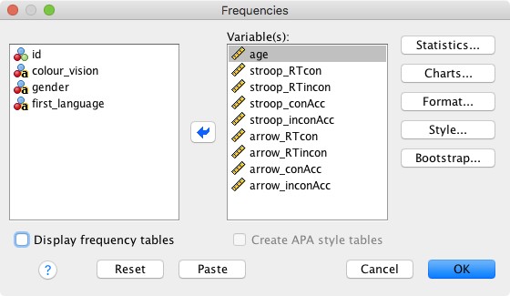
Here, we have the following options:
- Statistics; select these:
- Mean
- Median
- Std. deviation
- Minimum
- Maximum
- S.E. Mean (standard error of the mean)
- Charts: Choose “Histograms”, and tick “Show normal curve on histogram”
- Format: Not currently of interest
- Style: Not currently of interest
- Bootstrap: Not currently of interest
Finally, you might want to uncheck Display frequency tables (as they won’t be informative), and click on “OK”.
Let’s have a look at the output for the arrow flanker task (the Stroop task will later be part of an exercise). Some things to note from the Frequencies table and the histograms:
- Accuracy is generally very high (a ceiling effect), resulting in distributions that deviate very clearly from a normal distribution. This very pronounced deviation from normality makes it problematic to run parametric statistics such as t-tests on the accuracies (e.g., to test questions such as “Is there a higher error rate in the incongruent condition?”)
- If a statistical test requires normality and your data are not normally distributed, a frequent recommendation is to transform the data. This topic goes beyond what we will cover in our lab class, but Andy Field talks about this in some detail in his chapter “Correcting problems in the data”.
- Please also note that not everyone recommends data transformations though (see “To transform or not to transform…” in the same chapter of Andy Field’s book).
- One participant has a very low accuracy (around chance).
- This might happen for a number of reasons: They misunderstood the instructions, they misremembered the stimulus-response mapping, or they did not pay attention to the task.
- If a participant’s performance is close to chance, it is often better to remove them from the analysis.
- Our raw RTs tend to be positively skewed (i.e., they have a long tail on the right side of the distribution); this is not particularly problematic for two reasons:
- We have a large sample size; as a result, the sampling distribution of the mean will be normally distributed anyway (look up the central limit theorem in the statistics book of your choice).
- Most inferential statistical tests we will run will investigate the interference effects; these values somewhat closely approximate a normal distribution (compute the histograms for the interference scores to check this).
Conclusion: We should have a closer look at the low-performing participants. Let’s use boxplots (also called box-and-whisker plots) for this. Boxplots are often a good way to get a quick overview of potential outliers. The most comprehensive explanation of SPSS boxplots I could find was available here:

Please note that other software packages might have different rules for drawing the whiskers and defining outliers/extremes. Also note that SPSS uses the terms “outliers” and “extremes” differently from how I used them in the Excel labs.
To get the boxplots: Analyze → Descriptive Statistics → Explore. Let’s explore the accuracies in the flanker and the Stroop task. We also ask SPSS to label cases by participant ID (this will only apply to outliers and extremes).
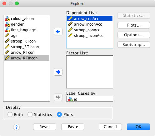
Options
- Statistics: Greyed out because we selected Display → Plots
- Plots: Only select “Dependents together”
- Options: Choose “Exclude cases pairwise”
- Bootstrap: Not currently of interest
Click on OK and inspect the output.
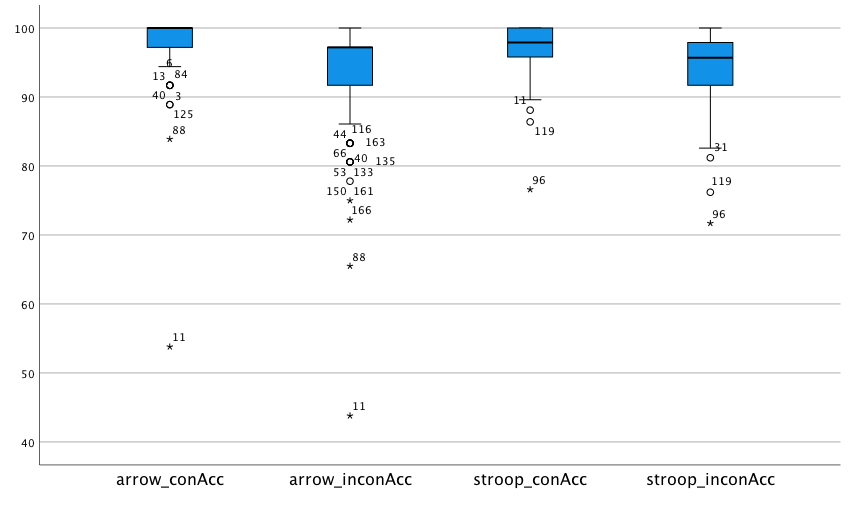 For the arrow flanker task, the following participants are identified as extreme: 11, 88, 166, and 161. Apart from participant 11, the accuracies for those are around 70%. I would tend to consider this a low, but still acceptable performance. Participant 11, however, is at chance performance. I would therefore exclude them from any analyses involving the flanker task.
For the Stroop task, participant 96 is identified as extreme. Remember that there were 4 response alternatives for the Stroop task, so chance performance would be 25%. Again, I would tend to keep this participant as their performance is not close to chance.
Now, the question is if we should remove participant 11 from all analyses (so, not just those involving the flanker task). Note that they are also marked as an outlier for their accuracy in congruent Stroop trials. Let’s have a closer look at their performance in the Stroop task: It turns out that they made more errors in the congruent as compared to the incongruent condition. While they are not the only participant for whom this is the case, they are the participant with the most pronounced difference (the congruent error rate is 9.2% higher). Taken together, I would tend to remove this participant from all analyses due to their unusual behaviour.
So, how are we going to remove this participants’ data from all analyses?
Save the data file under a new name (e.g. adding
_cleanedto the file name).Click on the row with participant 11’s data, such that the row is selected (all columns are highlighted in colour).
Click on “Edit” and “Cut” to remove the participant.

Re-save the data.
In this example, we have excluded a participant because we considered them an absolute outlier (i.e., we mainly relied on their absolute accuracies to remove them). We have not used statistical criteria (e.g., SD or median absolute deviation) to remove participants. Next week, we will show you how to use SDs for outlier removal. While it is also possible to implement an outlier rejection based on median absolute deviations in SPSS, it’s a real pain to implement and we will therefore not cover it here.
Another issue that we are not going to address at present is the fact that some participants have negative interference scores. Think about why might this happen. Should these participants be removed or not? We will discuss this issue in the lab class.